Common Reasons Why a Website Sucks
As a professional marketing and web design agency, we have seen firsthand how certain pitfalls can turn a promising website into a digital ghost town. Key issues such as slow loading times, non mobile friendly interfaces, broken links, outdated content, security flaws, confusing navigation, unresponsive designs, unreadable text, intrusive pop ups, and ads can severely hamper user experience. Content related issues like boring, unoriginal, or poorly written content, unappealing design, lack of clear calls to action, unclear target audience, insufficient social proof, poor SEO, vague value propositions, and missing contact information further degrade a website’s effectiveness. Additional factors like accessibility issues and non compliance with privacy regulations also play a crucial role. Recognizing and addressing these problems is essential for creating a website that not only attracts but also retains visitors.

Technical Issues
Slow Loading Times
Websites that load slowly highlight a key reason why a website sucks. In our fast paced world, users expect instant access to information. Slow loading, often caused by large image files, inadequate hosting solutions, or unoptimized code, is a major turn off for visitors. Optimizing these elements is crucial for engaging your audience effectively and reducing bounce rates, addressing a fundamental aspect of why a website sucks.
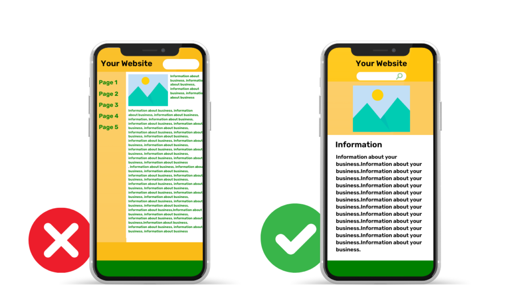
Not Mobile-Friendly
In today’s digital era, mobile browsing dominates. A website that isn’t optimized for mobile devices alienates a significant portion of the audience. Responsive design is vital for ensuring that your website provides an optimal viewing experience across all devices, from desktops to smartphones.
Broken Links and Outdated Content
Broken links and outdated content can severely damage a website’s credibility. They lead to frustration and a perception of negligence. Regular maintenance, content updates, and link checks are essential for keeping your website relevant and user-friendly.
Security Issues
Cybersecurity is a major concern for online users. Websites lacking robust security measures, like SSL certificates, are vulnerable to attacks, compromising both the website’s and users’ data. Implementing and regularly updating security protocols is essential for protecting your site.

Usability Problems
Poor Navigation
Complex or confusing navigation can quickly drive visitors away. A website should be intuitive, allowing users to easily find what they need. Streamlining your site’s navigation with a clear, logical structure is key to improving the overall user experience.


Unresponsive Design
An unresponsive website can lead to a poor browsing experience. In today’s diverse device landscape, your website must adapt to different screen sizes and orientations. Responsive design techniques are crucial for ensuring usability and consistency.
Unreadable Text
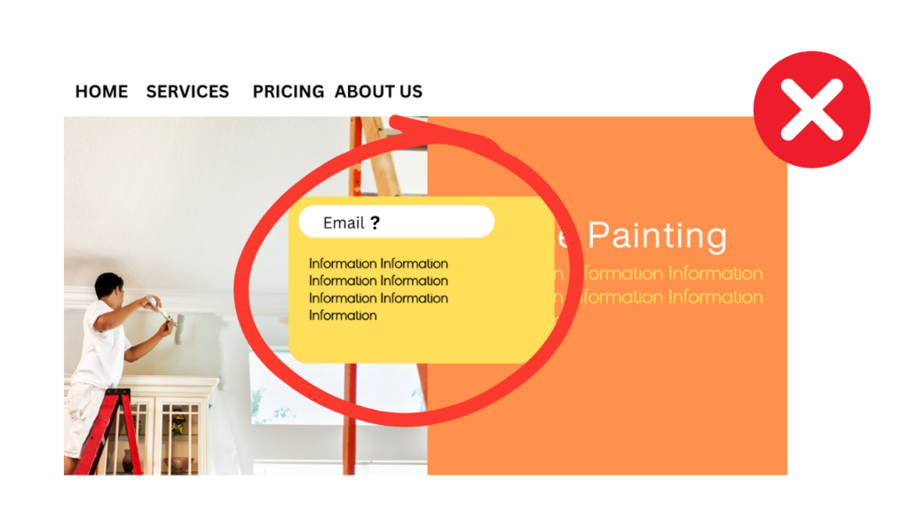
Text that is hard to read due to small font size, poor color contrast, or dense blocks of text can deter visitors from engaging with your content. Optimal font size, clear contrast, and well-spaced text are essential for readability.


Excessive Pop-Ups and Ads
While pop-ups and ads can be useful marketing tools, overuse can disrupt the user experience. It’s important to balance promotional content with user needs, ensuring ads and pop-ups are not obstructive but complementary to the user journey.
Content and Design Issues
Boring and Unoriginal Content
One of the primary reasons why a website sucks is content that fails to engage or provide value to the audience. Such ineffectiveness in a website can be turned around by crafting content that is interesting, informative, and relevant. Focusing on these aspects is essential to capturing and retaining user interest.
Poorly Written Content
Content quality reflects on your brand’s professionalism. Grammatical errors, typos, and awkward phrasing can detract from your message. Investing in professional copywriting and thorough editing is essential to maintain credibility.
Unattractive Design
First impressions count, and a poorly designed website can turn visitors away. A visually appealing design, aligned with your brand identity, is crucial for engaging users and creating a positive impression.
Lack of Clear Calls to Action
A website without clear calls to action can leave visitors confused about what to do next. Effective CTAs guide users towards desired actions, be it making a purchase, signing up for a newsletter, or contacting for more information.


Other Reasons
No Clear Target Audience
Websites that try to appeal to everyone often end up resonating with no one. Identifying and tailoring your website to your target audience ensures that your content and design meet their specific needs and interests.
Lack of Social Proof
Social proof, like customer testimonials and reviews, plays a vital role in building trust. Showcasing positive feedback from satisfied customers can influence potential customers and lend credibility to your offerings.
Not Optimized for Search Engines
SEO is crucial for online visibility. A website that isn’t optimized for search engines misses out on potential traffic. Utilizing SEO strategies increases your site’s visibility and drives more organic traffic.
No Clear Value Proposition
Your value proposition should be the centerpiece of your website. It needs to clearly state what you offer and why it’s beneficial, helping visitors understand the unique value of your products or services.
No Contact Information
Accessible contact information is a cornerstone of customer service and trust. Your website should prominently display contact details, making it easy for visitors to reach out with inquiries or concerns.

Additional Factors
Lack of Accessibility
Inclusivity in web design is not just ethical but also practical. Ensuring your website is accessible to individuals with disabilities expands your reach and demonstrates a commitment to equal access for all users.
Non-Compliance with Privacy Regulations
Adhering to privacy regulations like GDPR is critical in today’s digital landscape. Compliance not only avoids legal pitfalls but also reassures users that their data is handled with care and respect.
Not Responsive to User Feedback
User feedback is invaluable for continuous improvement. Actively seeking and responding to user input shows a commitment to your audience and helps refine and enhance the user experience.
Conclusion
Understanding why a website sucks is crucial to crafting a successful website. This multifaceted endeavor requires a blend of technical skill, user-centered design, quality content, and a deep understanding of your audience’s needs. By addressing the common pitfalls outlined above, you can transform a website from just being functional to one that is engaging and effective in achieving your business goals, effectively tackling the core reasons why a website sucks.


